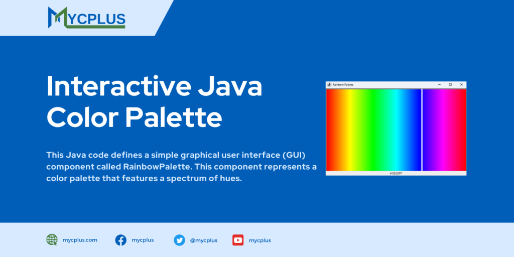
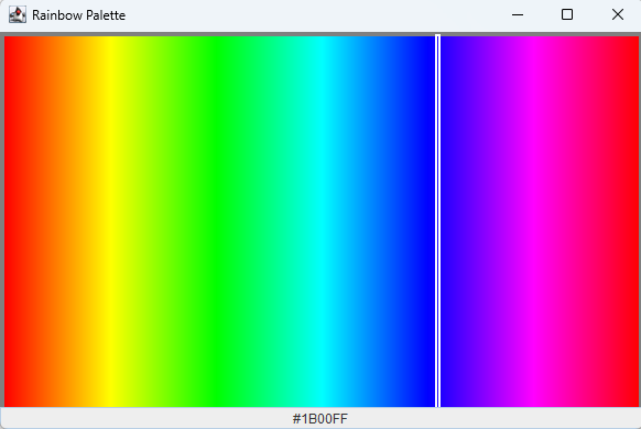
This Java code defines a simple graphical user interface (GUI) component called RainbowPalette. This component represents a color palette that features a spectrum of hues. Users can interact with the palette by clicking on different colors, and the selected color’s HEX value is displayed in a text box below the palette.
The code uses Java’s Swing GUI library to create a graphical window. The RainbowPalette class extends the JPanel class and implements the MouseListener interface to handle mouse events. The palette is drawn dynamically based on the user’s interaction, and the selected color is highlighted.
Key components of the code include, A color palette drawn with varying hues using the HSB (Hue, Saturation, Brightness) color model. It also, displays of the HEX value of the selected color in a text box below the palette.
import java.awt.*;
import java.awt.event.*;
import javax.swing.*;

class RainbowPalette extends JPanel implements MouseListener {

    private float selectedHue = 0;
    private Color selectedColor = Color.getHSBColor(0, 1, 1);
    private JTextField hexTextField;

    RainbowPalette() {
        addMouseListener(this);
        setPreferredSize(new Dimension(256, 24));
        setBackground(Color.gray);

        hexTextField = new JTextField(7);
        hexTextField.setEditable(false);
        hexTextField.setHorizontalAlignment(JTextField.CENTER);

        setLayout(new BorderLayout());
        add(hexTextField, BorderLayout.SOUTH);
    }

    public Color getSelectedColor() {
        return selectedColor;
    }

    private void updateHexTextField() {
        String hexValue = String.format("#%06X", selectedColor.getRGB() & 0xFFFFFF);
        hexTextField.setText(hexValue);
    }

    @Override
    protected void paintComponent(Graphics g) {
        super.paintComponent(g);
        int width = getWidth();
        int height = getHeight();
        for (int i = 0; i < width - 8; i++) {
            float hue = (float) i / (width - 8);
            g.setColor(Color.getHSBColor(hue, 1, 1));
            g.drawLine(i + 4, 4, i + 4, height - 5);
        }
        int x = 4 + (int) (selectedHue * (width - 8));
        g.setColor(Color.white);
        g.drawRect(x - 2, 3, 2, height - 7);
        g.drawRect(x - 3, 2, 4, height - 5);

        updateHexTextField();
    }

    @Override
    public void mousePressed(MouseEvent evt) {
        int x = evt.getX();
        selectedHue = (float) x / (getSize().width - 4);
        if (selectedHue < 0)
            selectedHue = 0;
        else if (selectedHue > 1)
            selectedHue = 1;
        selectedColor = Color.getHSBColor(selectedHue, 1, 1);
        repaint();
    }

    @Override
    public void mouseReleased(MouseEvent evt) {
    }

    @Override
    public void mouseClicked(MouseEvent evt) {
    }

    @Override
    public void mouseEntered(MouseEvent evt) {
    }

    @Override
    public void mouseExited(MouseEvent evt) {
    }

    public static void main(String[] args) {
        SwingUtilities.invokeLater(() -> {
            JFrame frame = new JFrame("Rainbow Palette");
            frame.setDefaultCloseOperation(JFrame.EXIT_ON_CLOSE);

            RainbowPalette rainbowPalette = new RainbowPalette();
            frame.getContentPane().add(rainbowPalette);

            frame.setSize(600, 400); // Set initial window size
            frame.setLocationRelativeTo(null);
            frame.setVisible(true);
        });
    }
}
Here is the screenshot of the Java Color Selector Component.